library(tidyverse)
library(ggplot2)
library(plotly) # for 3d scatter plot

# read in csv
treasury_data <- read.csv("seminar-material/treasury.csv", stringsAsFactors = FALSE)Seminar 4
Overview
The goal of seminar 4 is to review the material on Principle Component Analysis (PCA). We will first work through Question 1 in Problem Set 3, before reviewing the coding examples below.
Load packages and data
Data cleaning
# Reshape the data into wide format and remove rows with NA
treasury_wide <- treasury_data %>%
  select(data_date, series_name, data_value) %>%
  pivot_wider(names_from = series_name, values_from = data_value) %>%
  drop_na()  # Remove rows with NA

# View the reshaped data without NAs
head(treasury_wide)
# A tibble: 6 × 7
data_date `3M` `6M` `1Y` `3Y` `5Y` `10`
<chr> <dbl> <dbl> <dbl> <dbl> <dbl> <dbl>
1 1981-09-01 17.0 17.2 17.1 16.6 16.1 15.4
2 1981-09-02 16.6 17.3 17.2 16.4 16.1 15.4
3 1981-09-03 17.0 17.4 17.3 16.5 16.1 15.5
4 1981-09-04 16.6 17.4 17.2 16.5 16.2 15.5
5 1981-09-08 16.5 17.4 17.3 16.6 16.2 15.6
6 1981-09-09 16.4 17.1 17.0 16.6 16.2 15.5# Remove the date column and standardize the data
data_for_pca <- treasury_wide %>%
select(-data_date) %>%
scale() # Standardize the dataPlot data
Simple 2D scatter
ggplot(data_for_pca, aes(x =`10`, y = `3M`)) +
geom_point(color="blue", size=0.5) 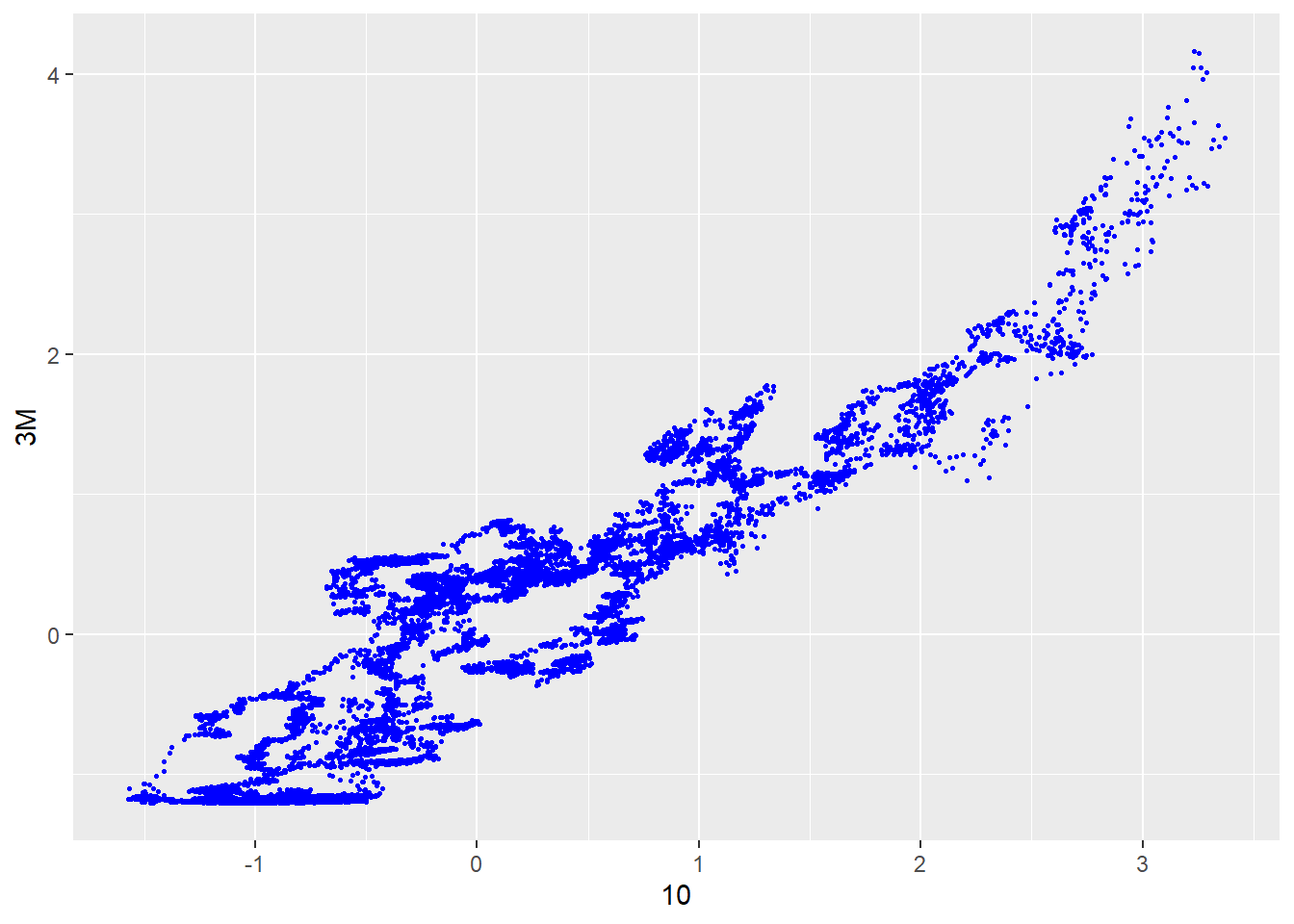
More advanced 3D scatter
data_for_pca <- data.frame(data_for_pca)

plot_ly(
  data = treasury_wide,
  x = ~`10`,       # Use backticks for column names with special characters
  y = ~`1Y`,        # Ensure column names exist in your data
  z = ~`3M`,        # Use backticks if needed
  type = "scatter3d",
  mode = "markers",
  marker = list(size = 5, color = ~`10`, colorscale = "Viridis") # Color mapped to a variable
) %>%
  layout(
    title = "3D Scatter Plot",
    scene = list(
      xaxis = list(title = "10Y Treasury"),
      yaxis = list(title = "1Y Treasury"),
      zaxis = list(title = "3M Treasury")
    )
  )
Perform PCA
# Perform PCA
pca_result <- prcomp(data_for_pca, center = TRUE, scale. = TRUE)

# Summary of PCA
summary(pca_result)
Importance of components:
PC1 PC2 PC3 PC4 PC5 PC6
Standard deviation 2.4213 0.35928 0.08123 0.03816 0.01558 0.01117
Proportion of Variance 0.9771 0.02151 0.00110 0.00024 0.00004 0.00002
Cumulative Proportion 0.9771 0.99860 0.99970 0.99994 0.99998 1.00000Plot the elbow-curve
# Scree Plot: Variance explained by each principal component
explained_variance <- pca_result$sdev^2 / sum(pca_result$sdev^2)
scree_data <- data.frame(
  PC = seq_along(explained_variance),
  Variance = explained_variance
)

ggplot(scree_data, aes(x = PC, y = Variance)) +
  geom_bar(stat = "identity", fill = "blue") +
  geom_line(group = 1, color = "red") +
  labs(title = "Scree Plot", x = "Principal Components", y = "Variance Explained") +
  theme_minimal()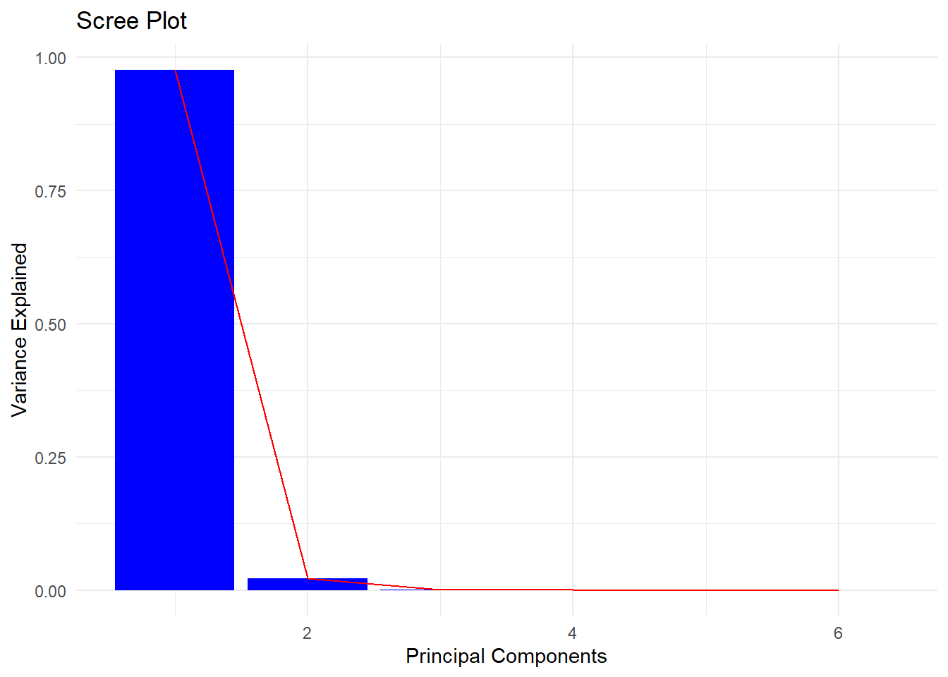
Visualize the factor loadings
# Multiply the first principal component scores by -1
pca_result$x[, 1] <- -pca_result$x[, 1]
pca_result$rotation[, 1] <- -pca_result$rotation[, 1]

# View factor loadings
factor_loadings <- pca_result$rotation
print(factor_loadings)
PC1 PC2 PC3 PC4 PC5 PC6
X3M 0.4066091 -0.4697895 -0.53519819 -0.4897180 0.2762128 -0.1068292
X6M 0.4087817 -0.3942278 -0.05659105 0.3320350 -0.6434283 0.3873398
X1Y 0.4108823 -0.2637237 0.35580956 0.5196171 0.3736753 -0.4747526
X3Y 0.4120884 0.1333893 0.54113891 -0.3299053 0.3023958 0.5650473
X5Y 0.4092176 0.3707498 0.18399549 -0.3819980 -0.4940162 -0.5208232
X10 0.4018288 0.6317309 -0.50702490 0.3537897 0.1859519 0.1504330Extract principle components
# Define the number of components to retain
n_components <- 6

# Extract the principal components
principal_components <- as.data.frame(pca_result$x[, 1:n_components])
principal_components$data_date <- treasury_wide$data_date
Reshape the data to plot.
# Reorder columns so the date is the first column
principal_components <- principal_components %>%
relocate(data_date)
# Convert principal components to a long format for ggplot
principal_components_long <- principal_components %>%
select(data_date, PC1, PC2, PC3) %>% # Keep only PC1, PC2, and PC3
pivot_longer(
cols = starts_with("PC"), # Select all columns starting with "PC"
names_to = "Principal_Component",
values_to = "Value"
)
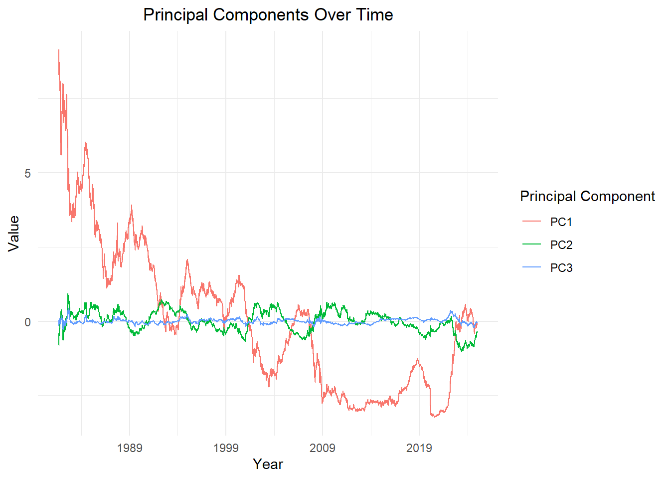
# Plot the data
ggplot(principal_components_long, aes(x = as.Date(data_date), y = Value, group=Principal_Component, color = Principal_Component)) +
geom_line(linewidth = 0.4) + # Adjust line thickness
labs(
title = "Principal Components Over Time",
x = "Year",
y = "Value",
color = "Principal Component"
) +
theme_minimal() +
theme(
plot.title = element_text(hjust = 0.5),
legend.position = "right"
) +
scale_x_date(date_breaks = "10 year", date_labels = "%Y")